Justine Tull
Graphic + Web Designer
Engineering
& Line Boring
BRAND IDENTITY
Honest, Hardworking and Engineered To Last.
For over 30 years, Engineering & Line Boring Ltd has been built on a foundation of family values, trust, and unwavering dedication. As industry leaders, they bring precision and expertise to the operation, servicing and repairing earthmoving, farming, and mining machinery—delivering reliability even in the harshest conditions. More than just machines, they put people first, ensuring the safety of their team and the public remains a top priority.
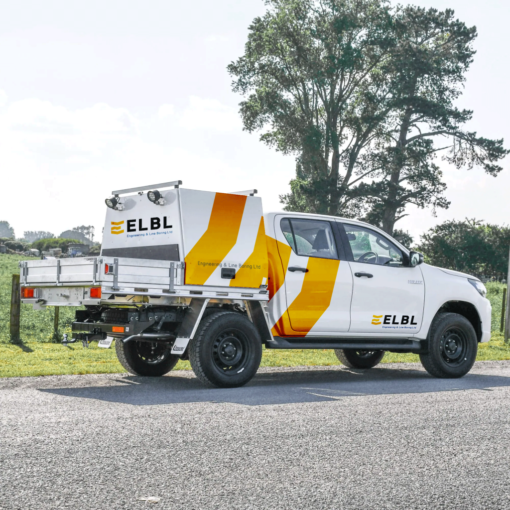
DURABILITY
The colour palette is inspired by the rich history of Lawson Engineering, drawing from the bold, high-visibility tones of yellow and black—an unmistakable nod to the heavy machinery industry, much like CAT and JCB.
Yellow injects energy, friendliness, and confidence into the brand, while black anchors it with a sense of strength and authority. To add a layer of sophistication and appeal to the corporate market, the black has been subtly refined with deep blue undertones to reinforces a professional, forward-thinking identity for future succession.
This palette strikes the perfect balance between industrial ruggedness and approachability, embodying both resilience and innovation.
Minimalist, Industrial
The re-brand is both minimalist and striking. Its simplicity ensures instant recognition and seamless adaptability across various platforms, from machinery to sleek digital branding.
Bold typography reinforces durability and reliability—core qualities essential to the construction and heavy machinery sector.
Every element of the design is intentional—bold, functional, and purpose-driven—embodying the company’s commitment to quality, resilience, and commitment to in the industry.
A Legacy of Reliability
Introducing an icon that seamlessly integrates Engineering and Line Boring’s custom signature typography.
This bold design, defined by structural lines, forms an abstract ‘E’ for Engineering. More than just an aesthetic mark, the icon embodies the company’s three core pillars:
Strength & Durability. Innovation & Efficiency. Trust & Reliability.
Designed to harmonise with the brand’s typography, the icon draws inspiration from the form of an excavator bucket symbolizing precision and industry expertise. Additionally, the L-shapes at the top and bottom, subtly resembling a shield, pays tribute to the Lawson legacy of trust.